Wednesday 3 December 2008

D and AD conclusion

This has been another really interesting brief due to the fact that it is a live one.  It has made shooting for it slightly more exciting in the respect that I can enter my images into the competition, so I've had to do well.

Not as long of a brief compared to the Vermeer one, still it was just as tight in time.  I'm really pleased with my images and especially pleased that I managed to get them all almost on the first shoot.  Of course, yes I could have shot more, thus giving me a larger selection to edit down from to fill my series of five, however I don't feel I needed to and the ones I have are as good as I would have shot.

The brief itself went quite smoothly when I actually got into it, and even my printing (which is usually my downfall) went well, and I've achieved my square images of a good quality.  Now all the assignments for unit 302 are complete and it's good to say that I'm pleased with all of my outcomes.

Just on a side note; I'm going to be entering this series as a series in the AOP student awards.

Final D and AD image series

These are the shots I produced and the final series for the D and AD competition.

They go in order from top to bottom.

(1)

(2)

(3)

(4)

(5)

I'm really pleased with how these images have turned out, better than I expected in fact. The first three images are first attempts and I felt I didn't need to go back and shoot them again, and the final two are re-shoots, and they worked on the second time. It is really odd that I've only tried one idea for this competition, but with time tight and the fact that I'm so pleased with them first time round, I see no point in trying to do more.

I felt that as a series they fit together very well also. I kept in mind whilst shooting various different things, such as the framing and keeping only a fragmented part of the bodies in shot. I also wanted to make sure that the hand positions were similar in every shot, so as to have something to link the images together. Another way I did that was in the post production work I did to them; I attempted to get similar colours in each image by de-saturating them all slightly and giving them all a similar feel and I just think that this was more aesthetically pleasing in the photographs.

When actually sequencing the five images it was important for me to get them in the right order and right positions. Image 1 and 3 are both similar colours so I chose to have them apart and separated by a darker image. I also chose to flip a couple of them horizontally so as not to have all the bodies in the same positions across the series. Although this goes against what I said previously about having identical positioning in an image, I feel that the variation in these holds them together better.

I've also chosen to use images 1, 2 and 3 as portfolio prints alongside the three vermeer ones to make my total of 6.

Sunday 30 November 2008

Failed attempts


Developing from my ideas, I've managed to shoot what my intentions were, although along the way there were a few mishaps and mistakes, so I thought it necessary to show these.

The are a number of problems with the two images above; the fact that I have got my angle wrong and his neck is partly in the frame which is quite distracting, also he has his hands out too far and so the rest of his body is out of focus (which I didn't want), and finally his hand position is not what I wanted and not revealing enough of what is in his hands. These things are my fault and I should have directed him better...something that I will have to do better when I re-shoot.


There is nothing wrong in particular with this image, just that I tried the shot with the model having gloves on, and when I looked at them all together this one stood out, so I'm not using it.


And I think it's plain to see what went wrong here (haha), the only one that I shot indoors and as a result I took my light reading wrong and exposed the wrong things.

The shoot

These are the images I shot the other day for my idea on hands and objects.


My favorite from the shoot are the two below.  I particularly like the one of the man in the camo jacket and think it works really with the location in the backdrop of it.


I'm pleased to say that the shoot went really well apart from a couple of mishaps.  I shot two frames of each image and I've decided to put up the best one of the two here.  I was struggling for a while to think of a final object to be placed in the hands, but in the end I decided to go with a hip flask.  I've chosen this so as not to show wealth or poverty but to show show signs of an alcoholic; a way to say that this could be either wealth or poverty, and it effects both sides.


Compiling a series

The other week we were given a Seminar by Stuart Whipps on sequencing and making a series of photographs. It was really useful and perhaps essential for us now in third year as we are about to leave and we will be attempting to make money from our photographs.


Although a lot of what he told us obvious things, it was actually some things that I have tended to overlook in the past. I've decided to think about it again and look at his images due to the current competition brief, as they go hand in hand.


I really like this series of work of his titled 'Aladdin Houses', which are photos about houses built cheap and quickly for workers in Austin Village.

They are obviously a series simply from the way that they look. The framing is identical in all of them, keeping the roofs of the houses the same distance from the top of the frame in every image, making them sit in the same place every time. This is useful as it leads the viewer from image to image nice and easily and coherently. The colours are also very similar in each shot, which allows a viewer to identify that the image belongs to a particular series.


To have had that seminar and to look at these images has been very useful and in doubt will help me to shoot for my series in the D and AD competition. I just need to remember while shooting what I want from the image and what I need to keep the same about them all.

Shoot ideas


After looking at a lot of wealth and poverty images, I've really become fascinated with the images of hands and cropped frames that I found.  I've  decided I really want to experiment with this and shoot my images based on it.

I want to produce a series in answer to the brief where within the frame all the audience see is a cropped mid section of a body with the person's hands outstretched with various objects in them.  I want to focus on the hands and what is in then primarily which will then lead back through the image to the clothes the person is wearing and then finally to the out of focus backdrop; a progression through the image which will reveal more things.

My idea is to have objects placed in the hands which would be found in the person's pockets.  These things would be object that they carry round with them, are important to them, and in some cases define them.  I want the various objects to represent aspects of wealth and poverty through connotations associated with them.  The use of clothing on the model and backdrop will also represent this idea. 


As I need 5 images for the series I've sketched out 4 ideas (I'll have to think more about the last one) for shot locations with ideas for the objects in mind also.

For shoot 1: A person in a smart suit with wealthy objects such as a watch of jewelry in their hands.
2: A person stood with keys and a wallet in their hands and in the backdrop out of focus as an expensive car.
3: A person sat on a street, all ragged and dirtied up with nothing in their hands, to say they own nothing.
4: A person on a run down street with cigarettes and a few pennies to his name.

These ideas are not set in stone and could be changed when it comes to shooting them.

Also another important thing is that my shots will be se set up and my models told what to do, so that I have more control over what I'm shooting.  And I'm going to be shooting on square format on the hasselblad, as I feel a square image will lend itself more to the images I want.


Hands

After looking at the various images of wealth and poverty I think I'm on my way to formulating an idea to shoot. I particularly liked the image where the hand was holding the coin and the image where the man was sat on the street (the cropped image).

I think it could be interesting to look at hands, and what they contain, perhaps various possesions of their owners. Also with use of cropping and taking only an abstract part of the image, it could allow more focus to be on what is being shown.

After looking around, I've managed to come across a few cropped shots using hands as the forepoint.


(Paul Bordice)

I particularly like this image above of the person holding their hands behind. In reality it is just a simple shot, as in not much happening, however the use of angle and framing here works really well. I like how much the image is different compared to how it would have been as a full body shot.


(Ron Koeberer)

Again a similar sort of image of the cropped section with the hands. I like this idea more though; the idea of a frontal shot with an object in the hands.


(Katya Evdokimova)

(Keith Goldstein)

The two above are again examples of objects in the hands but this time I prefer them much more. It works really well that the hands are open and are blatently showing off what is in them. They work well with their backdrops also, and although taken by different photographers they would work well as a series.

The brief

The brief itself is set by D and AD, and we are asked to produce a series of exactly 5 images to tell a photo story to change people's perceptions on wealth and poverty.

I think with it being exactly 5 images, it could make working difficult as there is no room for leeway, and I need to show exactly what I want to show in no more than 5 images!

We are asked to challenge viewers thoughts on the subjects, and so the imagery I produce must be clear and hard hitting.  This could be interesting.

Millennium images of Poverty

So searching still on Millennium images, I look for work concerned with 'Poverty' and to be honest I feel the range of photo results were much better.


(Tim Kavanagh)

(Wieteke Tepema)

(Nadia Attura)

I found many images relating to the homeless like the ones above, and although they are effective in showing aspects of poverty, I feel that they are almost a little too obvious. However the image in the middle does something different by cropping it, which gives it a whole new feel. It really makes the image impersonal, and is focusing solely on the fact that a person is sat, begging on the street. Playing with cropping and framing could be interesting to experiment with.


(Ian Godfrey)

I really like this image of the boys playing football in the street documentary style. I think the tones and colours work really well, and with the location being in what appears to a council estate/council flats, you really get the impression that it is run down and infact the opposite of wealthy.


(Victoria Dean)

(Tessa Bunney)

This is quite comical in appearence, and the way they are sat posing and smiling suggests they are proud of their home and life, which could almost be contradictory to the idea of poverty.

(Jenny Nordquist)

(Richard Rowland)

I quite like the look of these two last photographs; they are dead on and flat. I think that in doing this they give a clear perspective of what is being shown. They are however a little boring for my taste, and I would much prefer to have people within my own images, simply as a way to make them more striking.

Millennium images of Wealth

As a reasonable starting point to the brief, I decided simply to type in the words 'Wealth' and 'Poverty' into the Millennium images online database. I want to see other people's reactions and images in association with these words.

These are the 'Wealth' images...


(Martin Child)


(Stuart Brill)

I got in total about 96 results for the word, and unfortunately the majority of those were these awful images of expensive cars as seen above. I suppose this is showing wealth, however not in the sense that the brief would ask for, or the way that I would choose to show it.


(Justin Nicholson)

I then came across this photograph of hands holding two pound coins. I'm not sure that I particularly like the image, however I think that's it's doing something a little different and focusing on such a small thing in the large context of wealth.


(Kristina Hruska)

The image with the woman with the earring (ironically in the style of Vermeer) is quite well done and in my opinion represents the idea of wealth quite well. I like the subtlety of it; the way there is not much within the frame, yet we can tell that the lady is of some stature. I particularly like the crop of it.

Competition brief

(All of my entries have been uploaded today from another loacation, so as to avoid confusion)

Assignment four (the final assignment) in unit 302 is a competition brief, of which we have been given a choice of three competitions to enter.

These are live competitions and they are as follows:
D and AD - Tell a story through a photo-essay that changes people's perceptions of wealth and poverty.
Fujifilm Student Awards - Penguin books are looking for a new image to feature on the cover of Rachel Carson's 'Silent Spring'.
Vice Magazine Photography Competition - Create a piece of photography which explores the issue of gender, power and poverty.

To start with I don't even want to look at the Fujifilm brief, as to be honest I'm still sick of the one from in second year. The problem with the Vice photography brief is that the deadline is too close and I would like to actually enter. That leaves me with the D and AD competition (which sounds quite interesting anyway) and the challenge of producing exactly five images in a photo-essay about wealth and poverty.

Saturday 29 November 2008

Final Vermeer images/Conclusion

So these are my final four images for the Vermeer assignment...

(1)

(2)

(3)

(4)


After lots of editing on them and test prints, I have finally got my four final images, three of which will be used as part of the six needed for portfolio quality images (numbers 1,2 and 4), and these ones simply because they look better than the other one. I've always been pleased with images 1 and 4, and I'm really glad that image 2 came out well and I think that is does in fact work well within the series, despite being slightly different.

Overall with the assignment i'm pleased with how it has turned out, and i'm particularly glad that it's finished with! Not to say that it hasn't been worthwhile, because I've really liked (as I told Dinu) working on something a little different and something I am quite intersted in. I feel I've pushed myself hard and it has been tough throughout, but I feel I've worked well to the deadlines and acheived what I wanted to acheive.

Friday 28 November 2008

Another shoot

Trying to keep things a little more simple with this shoot I really took some inspiration from the work of Phillip Lorca Dicorcia. I really like how he uses natural light and makes an image look so powerful and have so much mood to it simply through the lighting and situation of model.


The location that I used was the side kitchen inside my house and to get enough light I had to use the windows and also I opened up a door, this as a way to fill a dark space with natural light which also created some interesting shadows. I wanted to have my model sat, looking towards the light, looking to something that the audience couldn't see. I tried a multitude of angles, and I feel the ones from afar didn't work well, however the close up ones look really good but don't really suit the style I have been shooting thus far. The best ones are where she is sat in the room and the angle is looking in upon her, and so I want to edit these down in the future to pick the best one out of the four.


I really like how these photographs have come out and also how simple the shoot was to set up. I feel that I've achieved what I set out to do in taking influence from Dicorcia and created good light with interesting shadows and situation.

Thursday 27 November 2008

Fifth shoot

Continuing on with the idea of capturing a sublime moment in time, last week I proceeded with my fifth shoot, where I set up in an empty room, a table with two chairs and from a doorway a sudden bright light was shining. I chose to have a model (as with all my images in the series) as the main focal point in the photograph, and also to have them being drawn to the light by looking towards to the doorway. I once again wanted to create this sense of a strange moment in time, wherein the audience don't know what is going on, gone on or is about to happen.


I did have a model in mind for the shoot, however whilst setting up during the day, the light being cast in from the window looked really good and so I used my housemates as stand-ins/tests to see what the outcome would be. These are the ones that look really bright and with really strange colours, and to be honest didn't work out possibly due to the conditions, however probably due to my exposures.

I do like how the light in the doorway has turned out, as I really feel it illuminates the images and is genuinely something to be drawn towards for both the model and the audience. Something I don't like about the images are my choice of model; I think he works okay, but he seems to stiff and aware he is in a photograph (something that seems to be difficult to avoid).


The reason that some images are the opposite to others is due to my scanning of them, and so far I've not actually decided which way round to have them; which way round will suit them best.


When shooting I used a bracket of exposures so as to have a good range of images to choose from post production. As you can see, some of my outcomes are too light and some too dark but there are certainly things that I can use.

I think that the images are adequate, just not as good as some of my previous shots, so I'll just have to see how they look within a series.

Wednesday 26 November 2008

Steel wall critique

Today we had the group critique of the steel wall images from the group. Because of the fact I saw Dinu the other day in a one to one we didn't actually touch upon my work. However the thing that was really useful, was the book he gave me which related to my ideas and work.

The book was on photographer Phillip-Lorca Dicorcia titled Contemporaries.


I can't actually believe I've never come across his work before, but I'm glad I have now because it looks fantastic.
It really lends itself to what I'm trying to do in capturing a sublime moment in time, however it does it in a different way to what I have looked at and shot myself. He uses daylight much more to an advantage in his photographs making them look really striking and slightly odd. The colours in the above images look amazing and really natural, and really help to give a dramatic feel to them.

Even though my images so far have consisted of me using studio lighting , I still think that an image like Dicorcia's would fit with them. I want to experiment with using natural lighting, and to see if it will fit in with the series.


I just wanted to put this photo in as it looks great.

Monday 24 November 2008

Dinu Li/Tutorial

When the Vermeer assignment was set, we were told that it was done so by not only Sarah but also professional practitioner Dinu Li, who would at some point be coming in to talk to us about his work and to critique our work to date.


He showed us a variety of his works and projects, but the one that mostly caught my eye, and was relevant to the brief was his series: Secret Shadows


The work was an attempt to show the lives and homes of Chinese immigrants living in Britain.


As a series I think they work fairly well, however not the most impressive work I've seen but there is clearly the Vermeer inspiration which I like, especially in the sense of lighting and shadow.


I really like this image of his, and I especially like the way in which it mimics a lot of Vermeer's paintings. As a viewer I am able to appreciate greatly the compositional elements to this photograph; if we look at the positioning of the woman on the screen, and then that in relation to the window, we see that she is looking out into the outside world, much alike the image of Vermeer's below. It is quite a subtle reference to Vermeer, but I think it works particularly well.


Just a quick thought on my tutorial with Dinu...

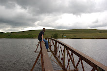
We only had about twenty minutes to talk together, but I feel it was very valuable to my work. We discussed my images that I've shot so far and the images that I was putting forward for the steel wall critique (as seen below). He told me that he liked these images, and my idea, however he was far more interested in my latest work; 'concerning negative space'. What he particularly liked was the negative space in the image, and the general composition within the frame.

This was surprising for me as I felt this work was the weakest that I've shot so far, and so it shows how valuable an outside opinion can be. Still though I've decided I don't want to follow this route of negative space images, mainly due to the fact that I've done it time and time again in the past.

The steel wall images...